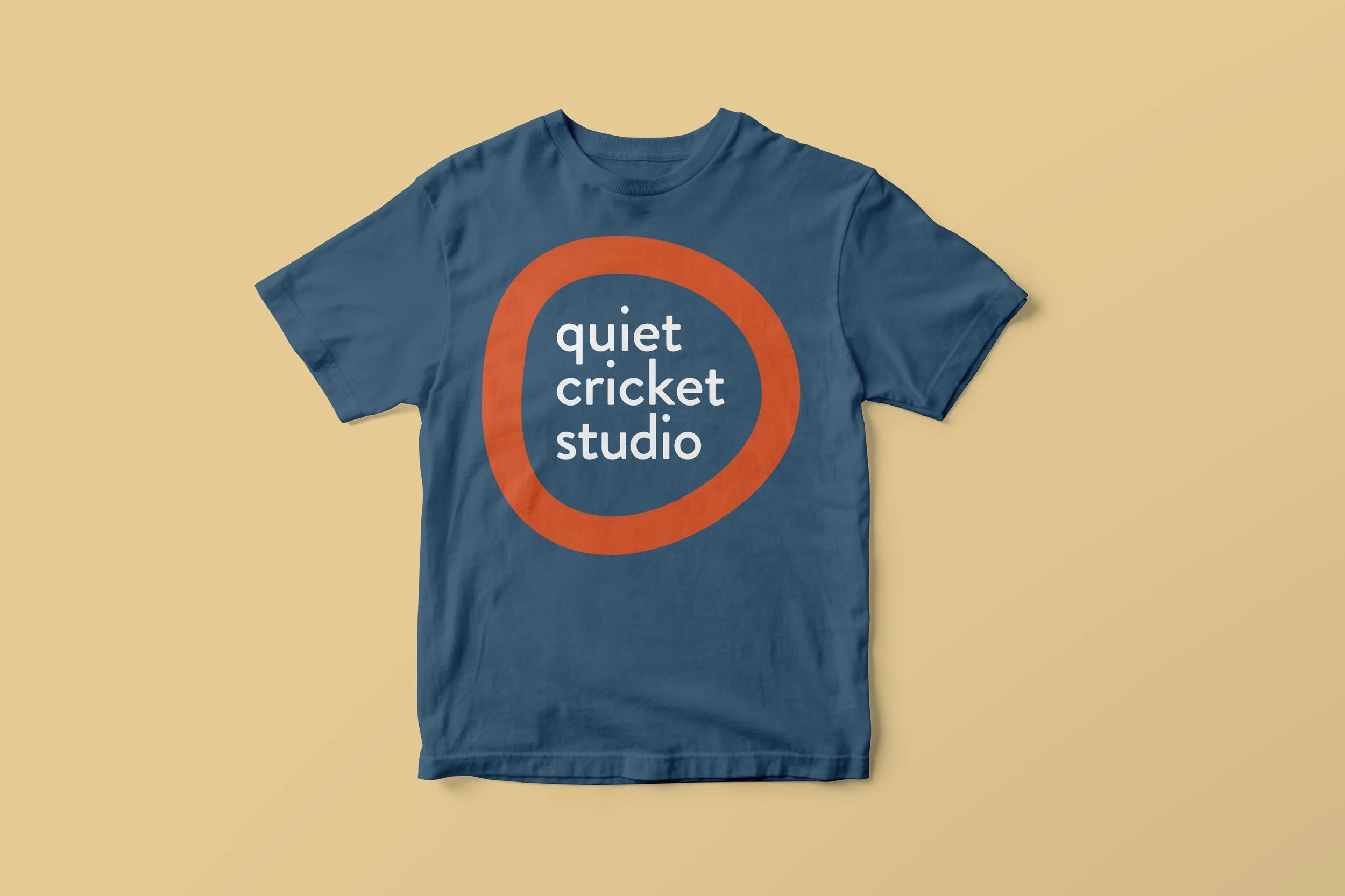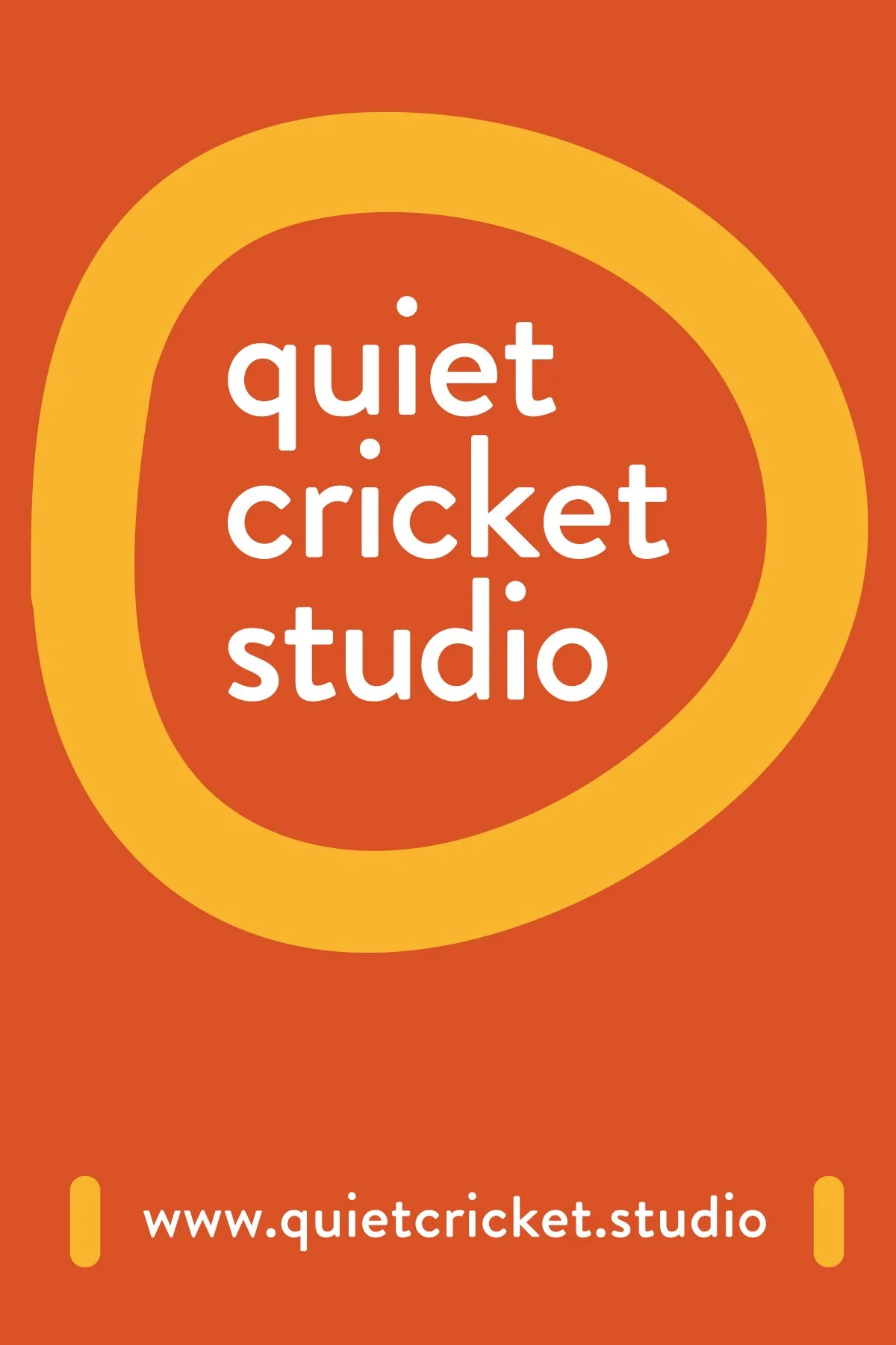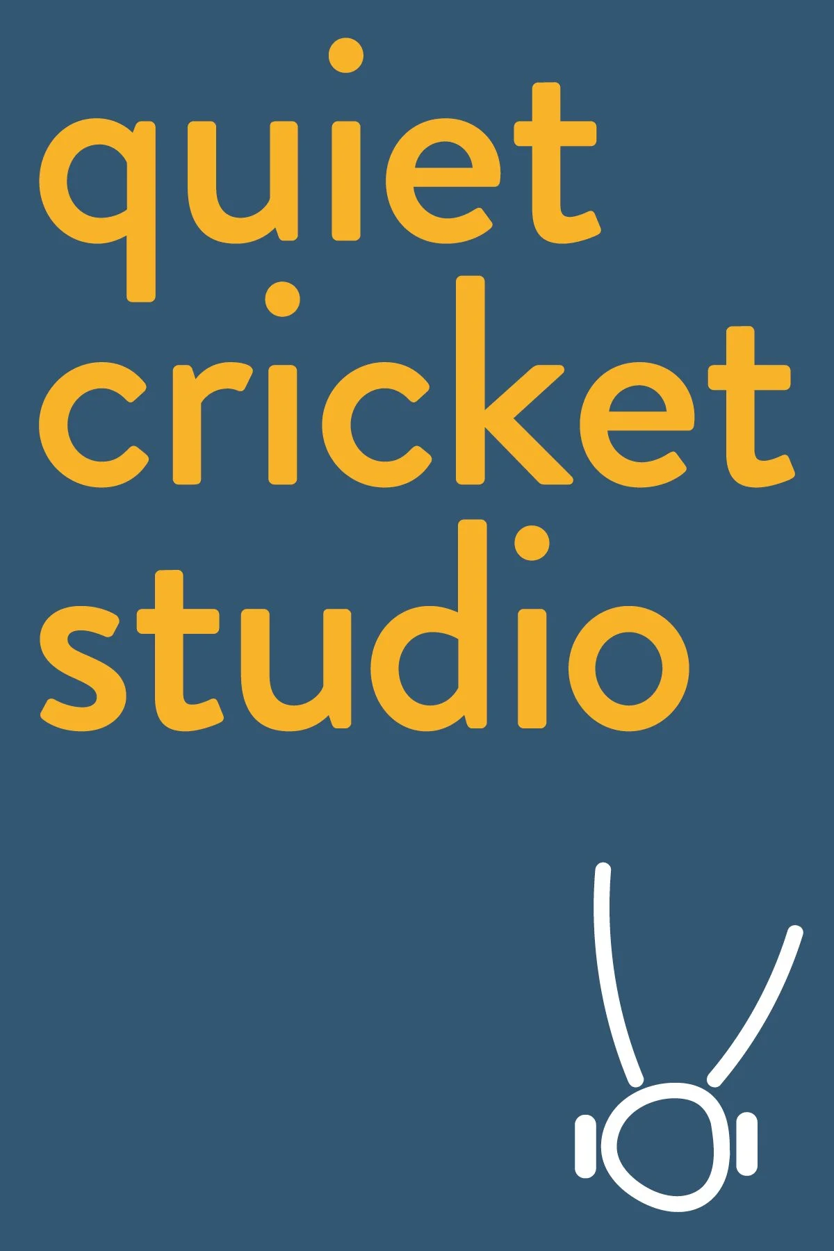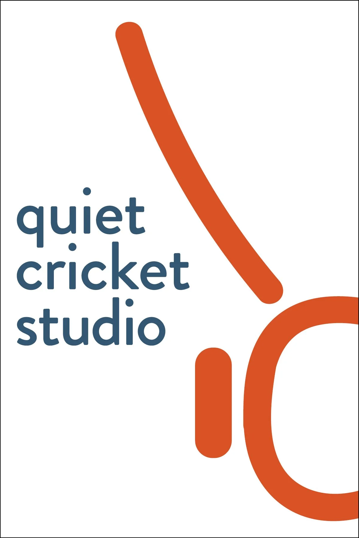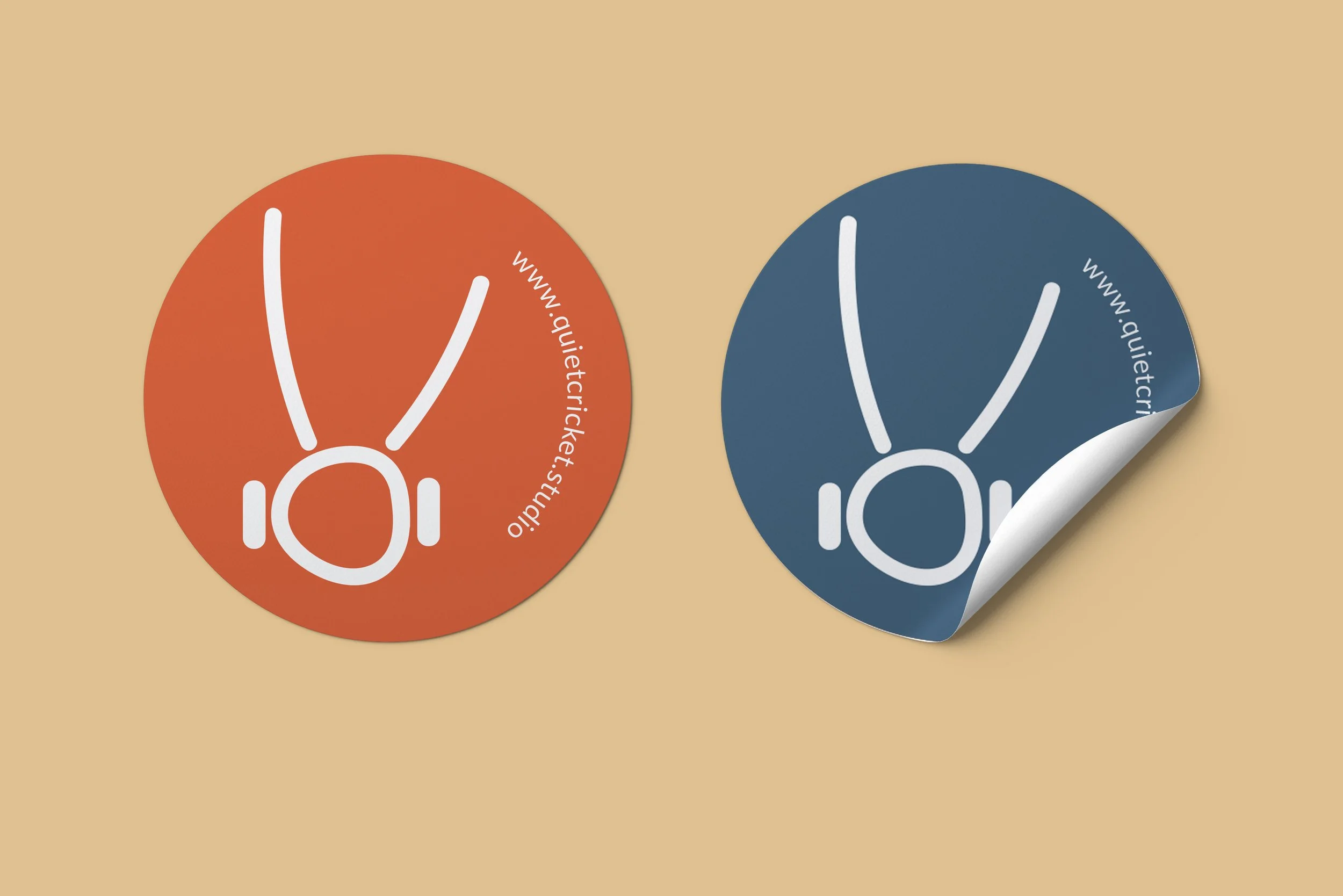
A playful and bold visual identity
The founders of Quiet Cricket Studio reached out seeking a visual identity and website to launch their new partnership. The studio space reflects the ethos of the founders—warm, welcoming and unique; any visual communication needed to do the same. This ethos is not only lived but a differentiator in a field where visuals tend to skew dark and cold.
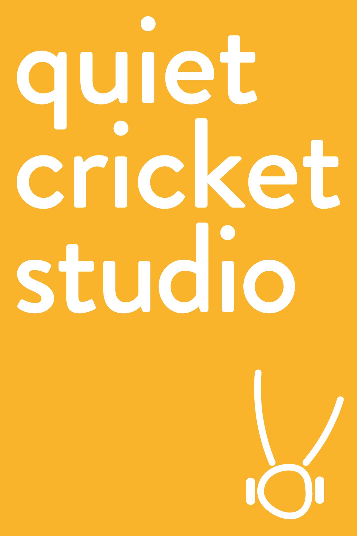
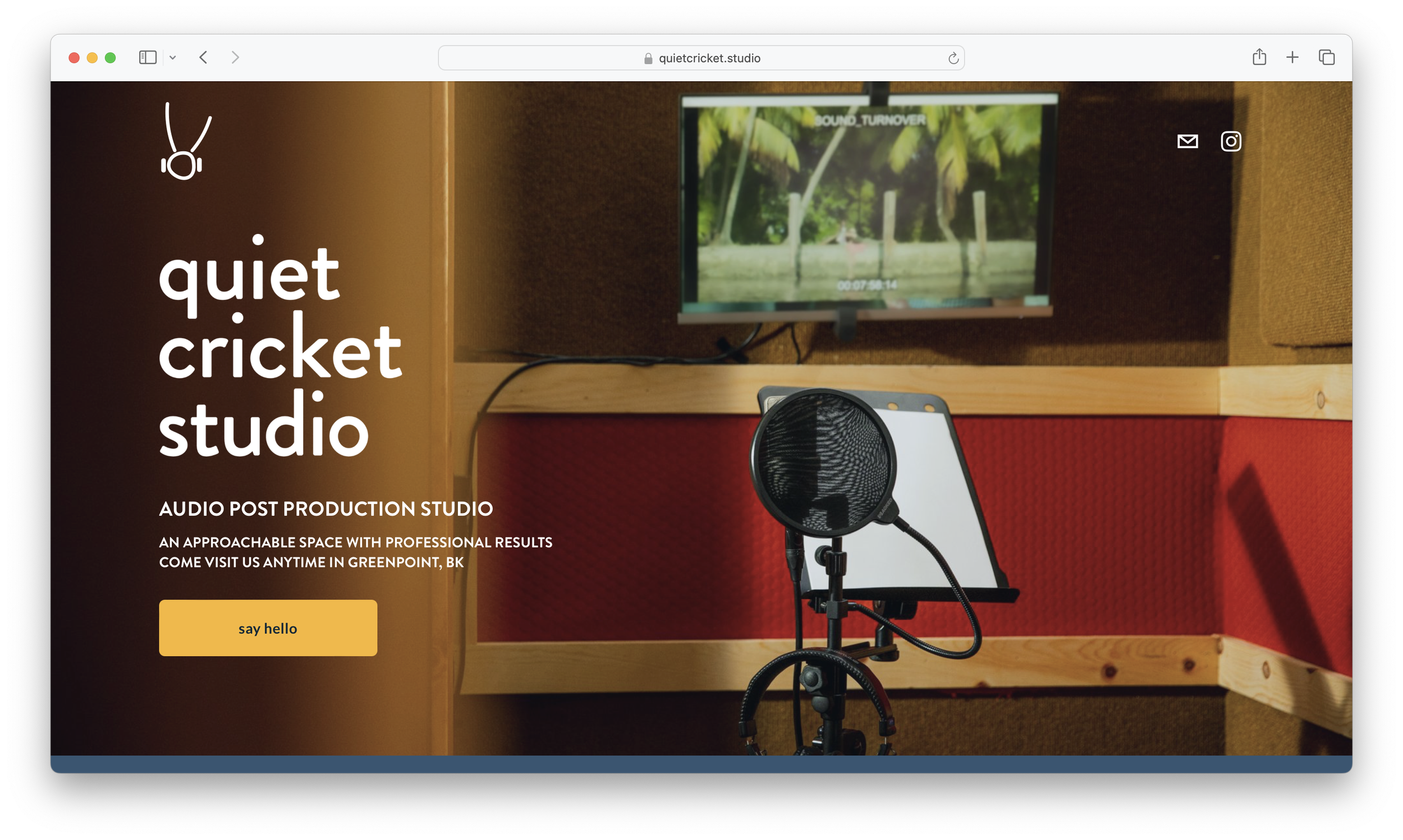
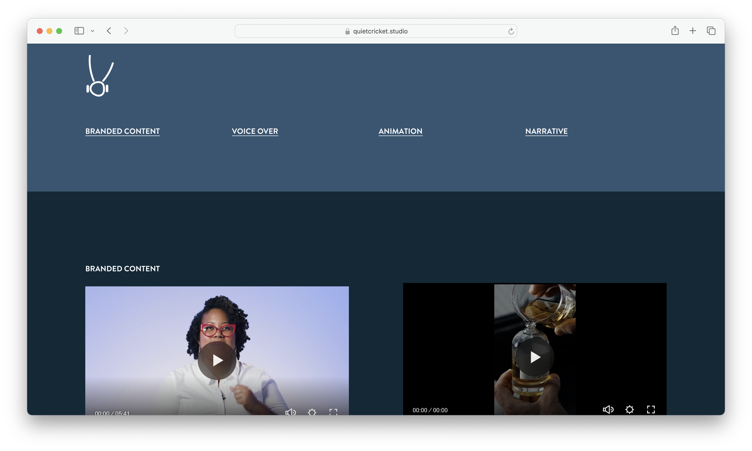
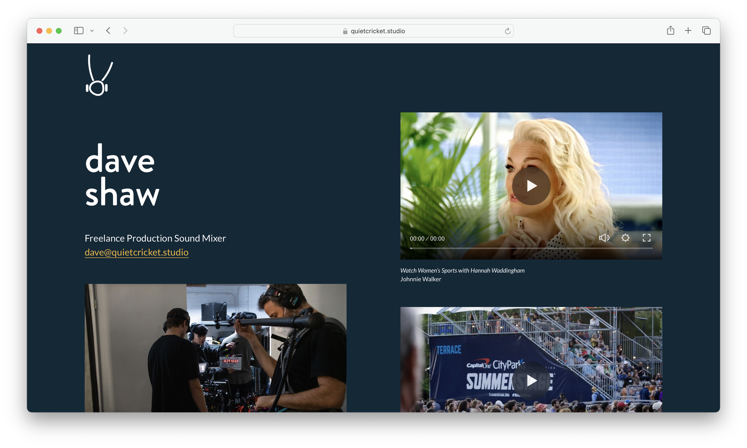
For inspiration we explored sound, nature and the associated letterforms. From three initial concepts, we selected a simple line drawing with flexible visual elements that speaks to the studio name and expertise. A friendly wordmark can stand alone or within the asymmetrical circle. The bold yet not primary color palette is warm and versatile. The new identity came to life through marketing materials and a website that relies on a long scrolling homepage to showcase the space, work and most importantly, ways to connect.
VIEW THE SITE:
CLIENT
Quiet Cricket Studio is an audio post production studio in Greenpoint, Brooklyn
Role
Visual Identity Designer,
Web Designer
Deliverables
Visual Identity including logo, logo usage recommendations, wordmark, color palette and typography
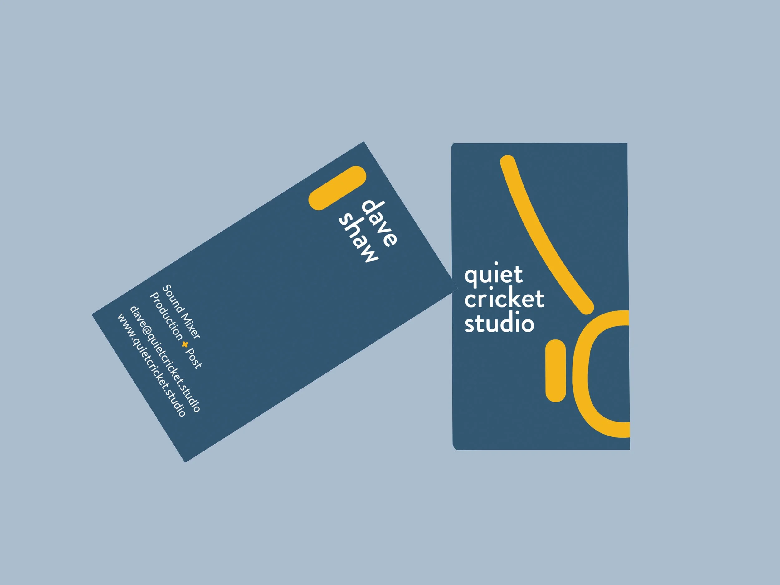
Supporting marketing materials including business cards and stickers
Squarespace Website
“Collaborating with Liza transformed and elevated our brand—we love the logo and website she designed and so do our clients. Since partnering with her, our pitches have been more successful, and our quotes have significantly increased as well!”
Dave Shaw, Co-Founder, Quiet Cricket Studio
